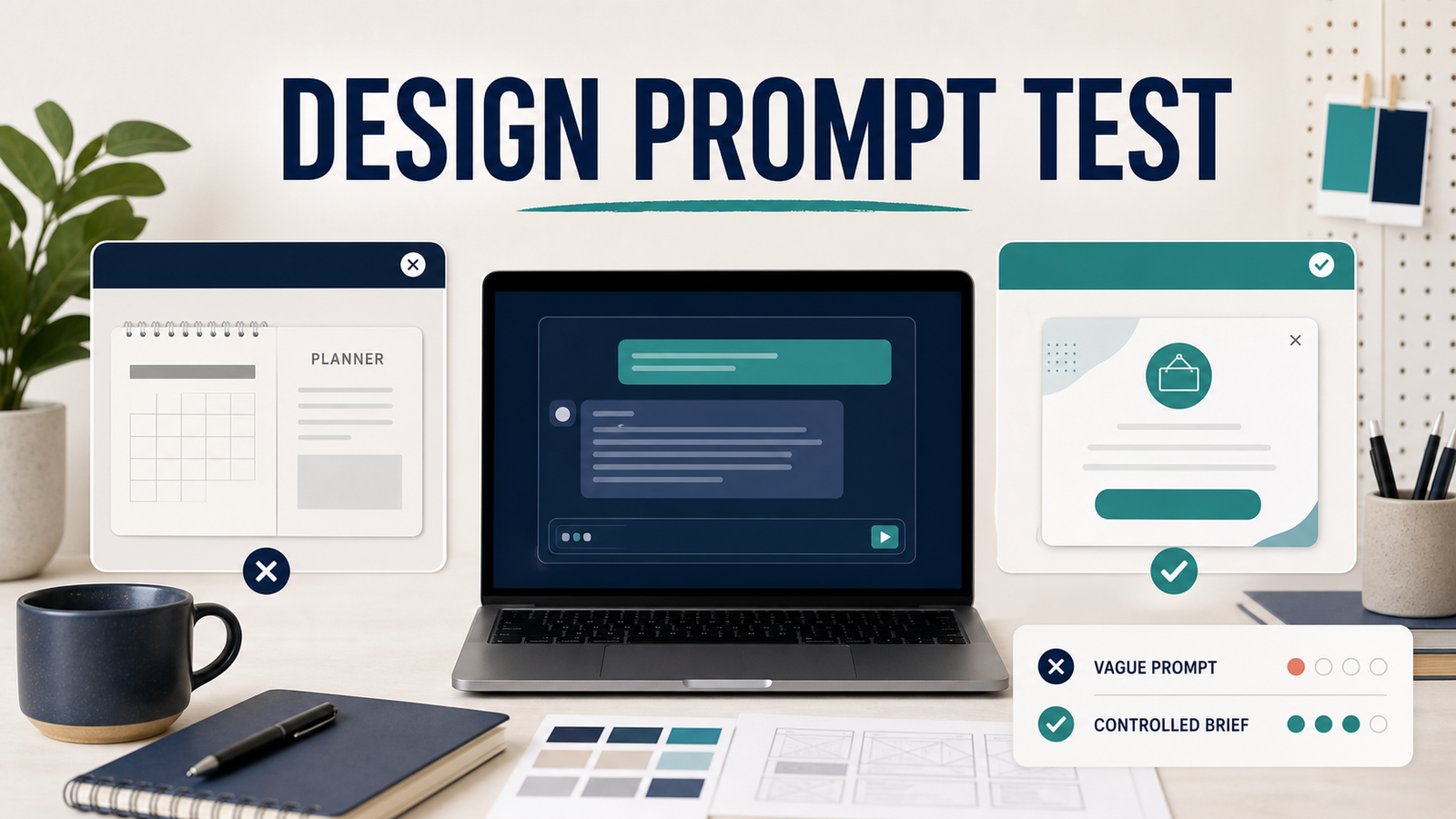
In my healthcare-marketing design work, I have seen polished AI output fail the real task because it was judged by appearance instead of channel, message, audience, and production fit. This fictional case comparison illustrates that failure pattern and the prompt changes that made the result easier to review.
I compared three approaches to a fictional clinic closure popup: a vague schedule request, a more controlled but misdirected planner brief, and a clinic-specific composition brief. My goal was not to find a magic prompt; it was to identify which missing decisions produced the wrong deliverable and which controls made the output usable for human review.
Test disclosure
This is a fictional case comparison, not a benchmark or a real client campaign. The clinic, closure notice, and visuals are fictional. No clinic name, logo, patient information, confidential brief, or client file was used. The English prompts below illustrate the comparison for an international audience.
Problem Breakdown & Direct Resolution
More detail helped only when it described the correct job. The vague prompt returned a Markdown planner. A more controlled prompt produced a clean image, but it was still a generic personal planner rather than a clinic website popup. The most useful direction combined the exact closure message with the background and visual hierarchy in one composition, while leaving brand-specific approval and quality control to a human designer.
The practical lesson is simple: do not ask for “a better image” until you have defined the deliverable, message, channel, audience, brand direction, and review criteria.
Step-by-Step Actionable Troubleshooting
The starting problem came from a familiar design situation: someone asks for promotional material without supplying the final copy or a clear format. When the content is missing, an AI tool may add generic sections, reuse assumptions from earlier context, or create a visually attractive layout that still needs to be rebuilt in Photoshop.
The same practical sequence applies to every run so that a cleaner image cannot hide a wrong deliverable:
- Define the deliverable: specify the website popup, its placement, and the desktop or mobile format.
- Lock the public message: supply the exact approved notice instead of asking ChatGPT to invent operational details.
- Run a baseline: record what a vague request produces before adding controls.
- Add production constraints: define audience, hierarchy, brand direction, exclusions, and required dimensions.
- Review release blockers: inspect spelling, artifacts, desktop and mobile crops, accessibility, links, and human approval separately.
Each result was reviewed against six practical questions:
- Deliverable: Is it a website popup rather than a planner, document, or social post?
- Message: Does it use the exact approved closure copy without inventing dates or details?
- Visual fit: Does it feel appropriate for a premium clinic rather than another type of business?
- Text quality: Are the letters readable, correctly spelled, and free from distorted glyphs?
- Image quality: Are there glossy, melted, broken, or unnatural details?
- Production value: Could a designer continue from the result without rebuilding most of it?
Test A: A Vague Schedule Request
The first request was intentionally broad:
Create a July schedule in any style you think works.Instead of a promotional image, the response created a Markdown planner with a calendar and extra sections:
# JULY SCHEDULE
Month at a Glance

Monthly Focus
Important Dates
To-Do
Notes
Work
Personal
Appointments / Events
The output was organized, but it failed the actual job. It chose text instead of an image, silently assumed a calendar year, and invented planner sections that had never been requested. None of those choices was necessarily unreasonable; the prompt simply left too many decisions open.
Designer verdict: Not usable as a clinic popup. The problem was not grammar or formatting. The task itself had never been defined.
Test B: A Cleaner Prompt, but the Wrong Target
The second brief added more visual control. The public English version of the brief was:
Create a clean 4:5 vertical July schedule in navy and teal. Include a seven-column calendar plus areas for Monthly Focus, Important Dates, To-Do, and Notes. Keep the English text crisp and correctly spelled. Avoid glossy, melted, warped, or broken details.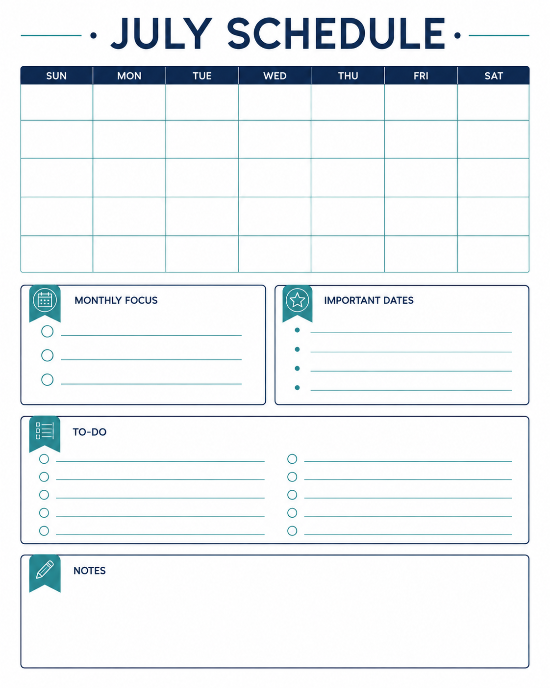
This result was visibly better than Test A. The hierarchy was clear, the spelling appeared correct, and no obvious glossy or broken areas were found during the review. However, it still solved the wrong problem. It was a generic planner, not a concise closure notice for a clinic homepage.
In a real design workflow, a clean image is not automatically a useful draft. The output still lacked the approved message, the website context, the clinic’s visual identity, and a reason for the viewer to notice the announcement. Rebuilding those decisions later would erase much of the time supposedly saved by generation.
Designer verdict: Cleaner, but not publishable. The controlled prompt optimized layout quality while preserving the wrong deliverable.
Why a Background-Only Workflow Also Failed
A third idea was to generate only a premium clinic background and add the copy later in Photoshop. That sounds efficient because it separates image generation from typography. In this test, however, the generated background included an oversized opaque center panel. The panel constrained the composition before the real message had even been placed.
The reviewer would not have continued from that asset. Removing or rebuilding the panel would take more effort than choosing a better direction at the prompt stage. This changed the working assumption: for this kind of popup, the background and short message need to be designed together. Photoshop is still useful for brand-specific finishing, but it should not be used to rescue a fundamentally wrong composition.
Improved Direction: Compose the Message and Background Together
The final English example used a globally recognizable closure date and an explicitly fictional clinic setting. It avoided the Korean holiday used in the private working test because that date would be irrelevant to most international readers.
Create a fictional premium clinic website popup in a 4:5 vertical format.

Use an elegant, softly lit clinic interior with warm ivory stone, subtle greenery, and a calm international aesthetic. Integrate a refined semi-transparent panel into the composition.

Show only this exact English copy:
NEW YEAR’S DAY
CLOSED JANUARY 1

Make the text large, correctly spelled, and easy to read on mobile. Do not add a logo, clinic name, contact details, people, medical claims, or extra copy. Avoid glossy, warped, melted, or broken details. This is a fictional editorial example, not a real clinic advertisement.
This version is closer to the intended workflow because it gives the composition a specific purpose, exact copy, channel, mood, and exclusion list. The short message is part of the visual hierarchy rather than an afterthought placed on an unrelated background.
It is still only an editorial draft. A real clinic would need its own brand system, approved operating information, accessibility review, responsive placement, and organizational approval. A generated image should never be presented as a real client campaign when it was not one.
Specification / Comparison Checklist
| Review area | Observed result | Release decision |
|---|---|---|
| Correct deliverable | Test A and Test B failed; the improved clinic brief matched the popup task. | Use the clinic-specific brief. |
| Exact message | Missing from A and B; supplied in the improved brief. | Block publication until approved copy is supplied. |
| Channel and audience | Missing from A and B; fictional audience defined in the final brief. | Confirm the real channel and audience before use. |
| Text and artifacts | The reviewed images were readable and showed no obvious artifacts in this run. | Inspect full-size desktop and mobile versions again. |
| Production readiness | A and B failed; the final result remained an editorial draft. | Require human QA and final authorization. |
This comparison is not a universal score for ChatGPT image generation. It records one controlled test, one reviewer, and one result per direction. Another session may produce different wording, typography, artifacts, or composition; the reusable value is the decision framework.
Real-World Pitfalls & Pro Tips: Five Mistakes This Test Revealed
1. Describing a topic instead of a deliverable
“July schedule” is a topic. “A 4:5 homepage popup announcing a clinic closure” is a deliverable. Name the channel, dimensions, and placement before asking for visual style.
2. Letting the model invent the copy
Operational dates and approved notices should come from the user, not the model. Lock the copy before generation and instruct the tool not to add names, claims, dates, or contact details.
3. Optimizing aesthetics before task fit
Test B looked cleaner, but the cleaner layout did not make it a clinic popup. Review purpose and information hierarchy before color, lighting, or decorative polish.
4. Assuming background-only generation saves time
Separating the background can help in some workflows, but it did not help here. The generated empty panel dictated a composition that conflicted with the final message. Test the production method instead of assuming it is efficient.
5. Treating the first polished output as final
Readable text in one image does not prove consistent reliability. Check spelling, dates, letter shapes, anatomy, reflections, surfaces, logos, and small details at full size. Then verify that the design still works in its real mobile and desktop placement.
A Reusable Brief for AI-Assisted Design Drafts
Use this structure before generating a promotional draft. Replace the bracketed fields and remove any instruction that does not apply.
PROJECT
Create a [deliverable] for [channel and placement].

SIZE
Use [pixel dimensions or aspect ratio].

AUDIENCE
The intended viewer is [audience].

PURPOSE
The design must help the viewer [desired action or understanding].

EXACT COPY
Use only this approved text:
[paste final copy]

VISUAL DIRECTION
Use [mood, palette, lighting, composition, reference qualities].

INFORMATION HIERARCHY
Make [primary message] most prominent, followed by [secondary message].

EXCLUSIONS
Do not add [logos, names, dates, claims, people, extra text, or other prohibited elements].

QUALITY CHECKS
Keep all text correctly spelled and legible. Avoid distorted letters, glossy patches, warped geometry, melted details, and broken objects.

STATUS
Treat the result as a fictional draft for human review, not a final approved advertisement.
Human Review Checklist Before Publishing
- Confirm every word, date, operating hour, and contact detail against the approved source.
- Inspect text and image details at 100% zoom instead of relying on a small preview.
- Check the result in the actual website popup dimensions on desktop and mobile.
- Apply the real organization’s typography, color, spacing, and approval requirements.
- Do not use an image as the only way to communicate an important closure. Provide accessible webpage text as well.
- Remove confidential information and use fictional placeholders during experimentation.
- Keep a human responsible for the final selection, retouching, export, and publication decision.
OpenAI’s prompt engineering guidance recommends clear, specific instructions and iterative refinement. Better instructions can reduce guesswork, but they do not make every generated detail reliable. OpenAI also advises users to verify important information because ChatGPT can produce incorrect or misleading outputs; see its accuracy and limitations guidance.
FAQ Section
Can a detailed prompt still produce the wrong design deliverable?
Yes. Test B included more layout control but still produced a personal planner rather than a clinic website popup because the channel, approved message, and production purpose were not locked.
Should I generate only the background and add the text in Photoshop?
Only when the background leaves genuinely usable space for the approved copy. In this test, the oversized center panel constrained the layout, so generating the message and background together was the faster route.
What must I verify before publishing an AI-assisted clinic popup?
Verify the exact public copy, closure date or hours, brand approval, spelling, accessibility, links, desktop and mobile crops, and final human authorization. Never place patient data, private client files, or unapproved operational details into the test.
Final Takeaway
The biggest prompt mistake in this test was not insufficient detail by itself. It was adding detail before deciding what the design needed to accomplish. A polished planner remained the wrong answer. A background-only asset remained the wrong workflow. The better direction began with exact copy, a defined website placement, a fictional audience, visual constraints, and a human review standard.
For a broader prompt framework, read How to Write Better ChatGPT Prompts. If you need structured work instructions rather than an image brief, compare the tested templates in Best ChatGPT Prompts for Work. To organize reusable files and project instructions, see the ChatGPT Projects guide.